

OI Tech OI viewer ACR
Live OI Dashboard — Concepts & Trading Edge Guide Powered by StockAiVerse | NIFTY • BANKNIFTY • FINNIFTY • SENSEX
🚀 OI Tech Snapshot
The Live OI Dashboard is the closest thing to an institutional-grade options radar that retail Nifty traders can get their hands on. Built around a real-time Centroid Engine and Strike Ladder, it strips away price-action noise and shows you what the market's heaviest money is actually committed to — CE walls, PE walls, OI migration, PCR skew, and intraday shifts that precede every major price move. If you trade Nifty options intraday and you're still reading plain option chains, this dashboard changes your game entirely.
✨ What It Shows — Core OI Intelligence
The dashboard (visible in the StockAiVerse OI Viewer tab) is organized into several deeply functional sections. Here is what each one reveals about live market conviction:
OI Centroid
The weighted center of gravity of all open interest across strikes. When price approaches the centroid it acts like a magnet — pulls and stabilizes. When it breaks away cleanly, you have momentum. Watch centroid migration tick-by-tick.
Strike Ladder (Heatmap) A color-coded OI intensity map across all strikes for both CE and PE. The darker (hotter) a strike, the more contracts are open there — this is where the invisible support/resistance levels live.
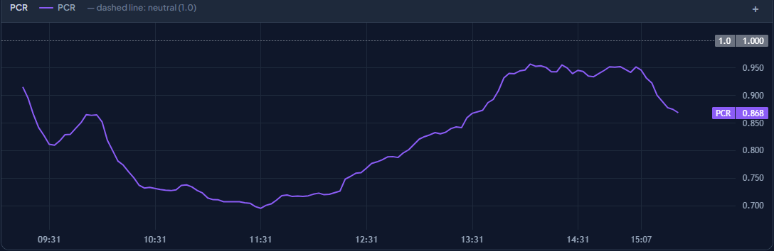
PCR (Put-Call Ratio) Shown live on the dashboard (e.g., PCR 0.808 in the sample). Below 1 = CE-heavy = mild bearish bias. Above 1 = PE-heavy = mild bullish support. Extremes often precede mean-reversion moves.
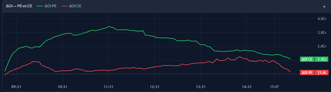
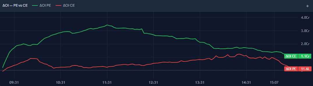
Delta OI (ΔOI) — PE vs CE The rate-of-change chart of OI build up or unwinding in real time. Two lines: green (ΔOI PE) and red (ΔOI CE). Divergence between them reveals which side is aggressively adding or covering — the first leading signal.
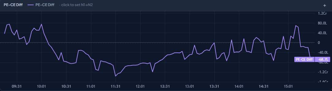
PE-CE Diff A single derived line showing the net difference between PE and CE open interest over time. Oscillates around zero. Sharp drops = CE OI adding faster (sellers getting active above). Sharp rises = PE OI adding (buyers defending below).
Snapshot Anchors (J1 / J2) Two user-definable time anchors — J1 (first of day, e.g. 09:16) and J2 (current/latest, e.g. 10:28). Lets you compare OI state at open vs right now — are positions building or unwinding since the opening bell?
ROC Table (Rate of Change) Click the PE-CE Diff line to set N1→N2 anchors and calculate the Rate of Change of OI between two precise moments — quantifying how fast smart money is moving into or out of a side.
Spike Counter Tracks sudden OI spikes (↑0 ↓0 in the sample). When spikes appear, it signals aggressive position-adding — often marks the start of a breakout or a fakeout trap, depending on price context.
🔥 Why You'll Love It — Key Trading Edges
• You get to see true support and resistance before price confirms it — not after.
• This lets you spot CE walls being built above price in real time, so you know exactly where to fade rallies.
• You get to identify fakeout zones — when price breaks a strike but OI doesn't unwind there, the breakout is hollow.
• This lets you measure market conviction direction via ΔOI divergence between PE and CE lines, catching momentum shifts early.
• You get to track centroid migration as a dynamic intraday magnet — whether price is being pulled toward or away from the center of mass.
• This lets you use PCR context to bias your directional stance — low PCR warns of potential snap-backs, high PCR of strong support holds.
• You get to compare today's OI snapshot at open (J1) vs now (J2) — quantifying whether institutions are adding or reducing risk exposure intraday.
📋 How to Read It — Step-by-Step
- Set your anchor J1 to the opening snapshot (09:16) and J2 to the current time. This gives you your OI baseline for the entire session.
- Look at the ΔOI PE vs CE chart first. If the green (PE) line is rising faster than red (CE), PE OI is building — the market is adding downside protection or bullish directional bets. Opposite divergence = CE sellers actively writing.
- Check the PCR value. If it's below 0.8, there's more CE OI than PE — overall bearish skew in the chain. If above 1.2, the market has significant PE cushion — expect support to be defended harder.
- Scan the Heatmap / Strike Ladder for the hottest strikes. The strike with maximum CE OI = overhead resistance wall. The strike with maximum PE OI = downside support. These are your intraday boundary levels.
- Monitor the PE-CE Diff line for directional shifts. When it turns sharply in one direction, smart money is repositioning. Click the line to anchor N1→N2 and compute the ROC to quantify the speed of that shift.
- Watch for Spike events (Spikes ↑↓ counter). A spike up in CE OI at an overhead strike while price approaches = reinforced wall. A spike in PE unwinding at support while price holds = trap for shorts.
💡 High-Probability Intraday Use Cases
These are timeless, repeatable scenarios on any trading day:
Use Case 1: Detecting a CE Wall Fade Setup Scenario: Nifty rallies toward a round number strike. The heatmap shows massive CE OI building at that strike, and the ΔOI CE line is rising sharply (more call writing above). The PCR dips below 0.8. Action: This is a textbook CE wall — the strike is a strong resistance zone. Rather than chasing the rally, you wait for price to stall, watch the PE-CE Diff curl down, and enter a PE buy or CE sell at that strike. The OI data tells you the market's biggest bet is that price won't cross — you're trading with the house.
Use Case 2: Catching a Fake Breakout Before It Confirms Scenario: Price breaks above a key CE OI strike intraday. Retail traders pile into CE buys. But on the OI dashboard, the ΔOI CE line starts falling (CE OI unwinding at the broken strike) while the PE-CE Diff doesn't widen — no new directional conviction. Action: This is a classic fakeout. The breakout is not backed by OI confirmation. You exit CE buys early or even fade the move by buying the ATM PE, targeting a snap-back to the centroid level. OI saved you from the #1 retail trap.
Use Case 3: Centroid as a Pullback Entry Magnet Scenario: Nifty opens with a strong directional move. The centroid is far below current price. As price momentum fades (ΔOI CE starts flattening, PE-CE Diff stabilizes), the centroid acts as a gravitational pull. Action: Identify the centroid strike. When price starts drifting back toward it and OI at nearby strikes is not rebuilding, the centroid zone becomes your pullback entry area. High-probability straddle or directional scalp entry with tight risk, because the OI center of gravity has told you where the market wants to balance.
Use Case 4: PCR Extreme Mean-Reversion Setup Scenario: PCR drops to an extreme low (e.g., below 0.6) — far more calls written than puts, indicating excessive bearish sentiment baked in. Simultaneously, the ΔOI PE line starts rising — put writers are covering and buyers are accumulating PE OI defensively. Action: The market is overcrowded on one side. When the PE-CE Diff line reverses upward sharply, it's a signal that the lopsided OI is unwinding into a counter-move. You get a high-conviction entry into the direction of the mean-reversion — not because of price alone, but because OI told you the imbalance was unsustainable.
Use Case 5: J1 vs J2 Snapshot Comparison for Session Bias Scenario: You anchor J1 at 09:16 (session open) and J2 at 10:30. Comparing the two snapshots, total CE OI has grown by 15% while PE OI is flat — institutions have been steadily selling calls above, reinforcing the overhead resistance. Action: Your session bias is now confirmed bearish at elevated levels. You avoid long CE positions and focus on PE buys on every small dip, knowing that the OI structure built since open is a ceiling — not noise. The J1→J2 comparison is your institutional positioning read for the entire day.
🌟 What Makes This OI Tool Special
Unlike lagging indicators that react after price has already moved, this dashboard tracks OI in real time — you see institutional positioning shifts as they happen, not in the next candle. The Heatmap visualization turns abstract option chain data into an immediate visual read of where the heaviest money is clustered, eliminating the cognitive load of scanning hundreds of strike rows manually. The Centroid Engine adds a dimension no standard chain provides — a dynamic, quantified gravitational center for price, letting you anticipate mean-reversion and breakout confirmation simultaneously.
Next Steps Ready to apply these OI concepts to your own live charts?
• Upload your own OI dashboard screenshot or PDF — I'll correlate the concepts to your exact market moment. • Ask me to walk through any specific section deeper: Centroid mechanics, PCR interpretation, or Heatmap reading. • Drop a price action chart alongside the OI dashboard — I'll show you exactly where OI confirmed or rejected the move. • Want a live analysis? Share today's dashboard and say 'Analyze this OI' — I'll switch to specific-day mode and give you the full read. You're now trading with OI intelligence. The market has no secrets from you.
OI Tech Explainer Skill | StockAiVerse | For educational and informational purposes only