

🚀 OI Tech Premium
Live OI Dashboard — Concepts, Edge & Execution Guide StockAiVerse | NIFTY Options Chain Intelligence
🚀 OI Tech Snapshot
The OI Tech Dashboard (StockAiVerse) is a real-time Open Interest intelligence engine built for sharp intraday Nifty options traders who want to read genuine market intent behind every price move — not just the candle.
It aggregates live OI data across all strikes, expiries, and timelines into a single command center covering the OI Centroid, PCR, Premium Ratio, CE/PE Premium dynamics, Phase-by-Phase Prem_Eff Analysis, Seller Affordability Map, ATM Premium Migration, and Heatmap visualizations.
If you trade Nifty options intraday and want to stop guessing and start reading the order flow with precision — this tool is built for you.
✨ What It Shows — Core OI Intelligence
Using the live dashboard snapshot as a reference, here is what each core section reveals about market conviction:
📍 Overview Panel — Spot Journey & Key Metrics
The Overview tab is your mission control. It displays:
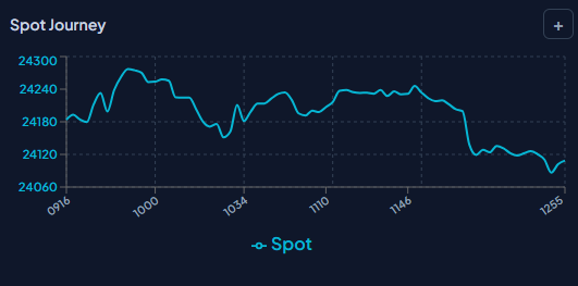
• Spot price movement from the first snapshot (Anchor J1 at 09:16) to the current moment (J2, latest snapshot), letting you see how far and how fast price has moved.
• PCR (Put-Call Ratio): Measures the balance of Put OI vs Call OI. A falling PCR (e.g. 0.97 → 0.80) signals increasing bearish conviction or call writing dominance.
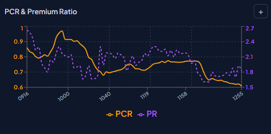
• Premium Ratio: Tracks the relative premium of CE vs PE over time — rising Premium Ratio means PE premium is increasing (sellers getting squeezed on puts, or buyers gaining).
• CE & PE Premium decay: Shows how much premium has eroded from the anchor point across both sides, helping you gauge IV crush vs directional premium behavior. • Spot Journey Chart: A continuous time-series of Nifty spot from open to current — instantly visualizes trend, range, and reversal zones.
📍 Premium Tab — Phase-by-Phase Prem_Eff Analysis
This is one of the most powerful and unique sections. It breaks the trading day into distinct phases (PRIME OPEN, MIDFLOW, DRIFTZONE, CURRENT) and for each phase shows: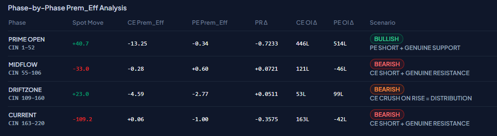
• Spot Move: How many points the market moved in that phase.
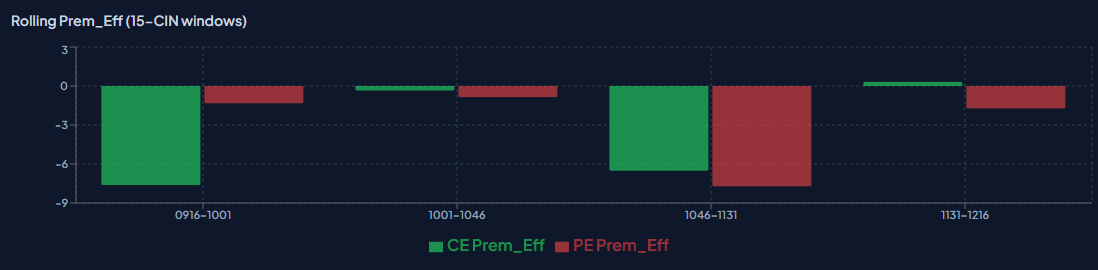
• CE Prem_Eff & PE Prem_Eff: Premium Efficiency — measures how premium responds per point of spot move. Negative CE Prem_Eff on a rally = CE sellers are dominant (distribution, not genuine buying).
• PR Δ (Premium Ratio Delta): How the Premium Ratio shifted in each phase — rising PR Δ = PE gaining premium faster than CE.
• CE OI Δ & PE OI Δ: Net Open Interest change in Lakh contracts. Large CE OI buildup on a rally with negative Prem_Eff = classic distribution trap.
• Scenario Label: Auto-tagged market condition (e.g., BEARISH – CE CRUSH ON RISE = DISTRIBUTION, CE SHORT + GENUINE RESISTANCE, CE COVERING).
📍 Seller Affordability Map
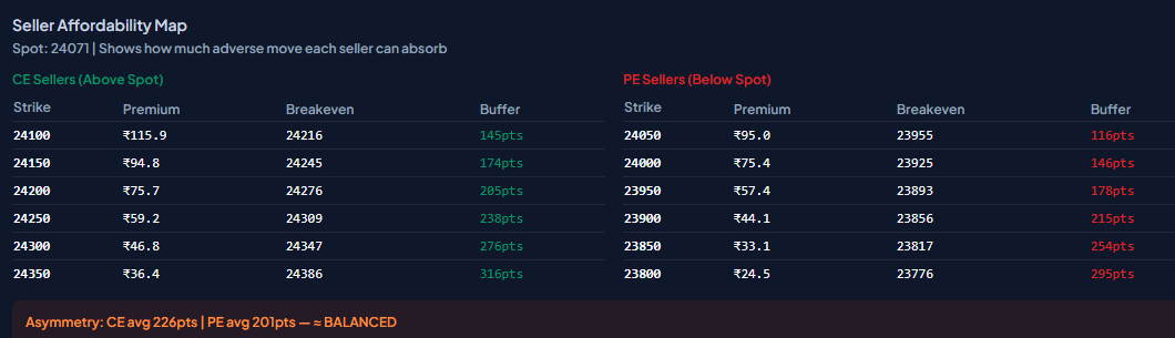
This section answers the critical question every options trader needs: How much adverse move can the current option sellers absorb before they capitulate?
• For CE Sellers (above spot): Shows each strike, the premium collected, their breakeven level, and the buffer (points of protection) they have.
• For PE Sellers (below spot): Same format — gives the floor each PE seller can defend before being forced to cover.
• Asymmetry Reading: If CE avg buffer >> PE avg buffer, downside is more heavily defended. If balanced, the market is in equilibrium — rangebound bias.
📍 PCR & Premium Ratio Chart
A time-series dual-axis chart tracking PCR and Premium Ratio simultaneously across the trading session. This reveals:
• PCR trending down = call writing pressure increasing, or put covering — bearish bias confirmed.
• Premium Ratio diverging from PCR = complex positioning — neither pure bull nor pure bear.
• Spikes in Premium Ratio = sudden premium expansion on one side, often after news or sharp spot moves.
🔥 Key Trading Edges
• You get to read real market intent — not just price. OI shows where big players are positioned, not where price happens to be.
• This lets you distinguish a genuine breakout from a fakeout in real-time, using CE Prem_Eff as the validator.
• You get to identify dynamic support/resistance levels backed by actual OI walls, not arbitrary chart lines.
• This lets you spot distribution phases early — when CE is being crushed even as price rises, you know it's not a real bull move.
• You get to measure seller affordability — knowing how much buffer CE/PE sellers have prevents you from fighting strong hands.
• This lets you time entries with phase-level precision — not just 'price is at support' but 'Phase 2 shows CE short buildup confirming resistance.'
• You get to track PCR & Premium Ratio migration across the session — spotting conviction shifts before price confirms them.
📋 How to Read It — Step by Step
1. Start with the Overview Panel.
Check the anchor (J1) vs current (J2) values for Spot, PCR, and Premium Ratio. This gives you the session bias at a glance.
2. Read the Spot Journey chart.
Identify the session high, low, and current trend. Note any clear reversals or consolidation zones.
3. Go to Phase-by-Phase Prem_Eff.
For each phase, check whether CE Prem_Eff is positive or negative on spot rises. Negative CE Prem_Eff on up moves = distribution. Positive = genuine buying.
4. Check CE OI Δ and PE OI Δ for each phase.
Large CE OI buildup = active CE writing (resistance). Large PE OI unwinding = PE sellers covering (floor weakening).
5. Use the Seller Affordability Map.
Find the nearest CE and PE sellers and their buffer. If CE seller buffer is thin, the call wall can break. If PE buffer is large, the floor is strong.
6. Monitor the PCR & Premium Ratio chart for trend.
Falling PCR + rising Premium Ratio = PE sellers getting stressed. This is often the precursor to a bounce.
💡 High-Probability Intraday Use Cases
Use Case 1: Catching the Distribution Trap at Open
Market opens gap-up or rallies hard in the first 30 minutes. Retail traders rush to buy calls. The OI dashboard shows CE Prem_Eff going negative (-0.5 or worse) on the spot rise, with massive CE OI buildup (e.g., 900L+ new CE OI). This is not buyers — this is institutional CE writers distributing into the rally. Scenario label: BEARISH – CE CRUSH ON RISE = DISTRIBUTION. Avoid going long. Watch for reversal as CE premium collapses despite spot rising.
Use Case 2: Confirming Genuine Resistance with CE Short
Spot approaches a known resistance zone. CE Prem_Eff stays negative or flat, PE Prem_Eff starts rising (PE sellers getting squeezed), and CE OI builds significantly while PE OI unwinds. This confirms the resistance is real — big players are writing calls here aggressively, not just at resistance by coincidence. Scenario: CE SHORT + GENUINE RESISTANCE. High-probability short setup or PE buying opportunity.
Use Case 3: Identifying CE Covering for Potential Bounce
After a downtrend, CE OI starts declining (CE covering — short sellers buying back their calls). CE Prem_Eff turns positive (CE gaining premium even on small up ticks). The Seller Affordability Map shows PE sellers with thin buffers. This combination signals the bears are losing conviction. Scenario: MILD BEARISH – CE COVERING. Watch for a potential snapback rally — don't hold fresh shorts here.
Use Case 4: Reading Asymmetry in the Seller Affordability Map
If CE avg buffer (e.g., 58pts) is significantly larger than PE avg buffer (e.g., 30pts), call sellers are well-protected while put sellers are vulnerable. This means downside risk is higher — a small adverse move can trigger PE covering (buying), amplifying a downward move. Use this asymmetry to position for range breaks rather than reversals. If the asymmetry is balanced, expect chop within the established range.
Use Case 5: PCR & Premium Ratio Divergence Signal
PCR falls sharply (increasing call writing or put unwinding), but Premium Ratio also rises (PE premium expanding). These two together indicate complex repositioning — PE sellers are stressed even as net PCR looks bearish. This divergence often precedes a sudden reversal or sharp intraday move. Watch for volume to confirm direction and do not carry overnight positions into such divergences without clarity.
🌟 What Makes This OI Tool Special
Unlike lagging indicators like RSI or MACD that react to price after the fact, this dashboard captures real-time OI shifts — the actual positioning of large players as it happens. The Prem_Eff framework goes beyond raw OI numbers and measures the quality of premium movement relative to spot, which is the difference between reading intent vs. just reading volume. The phase-level breakdown and Seller Affordability Map give intraday traders a structured, repeatable framework — not just a data dump.
📊 Phase-by-Phase Analysis — Reference Table
The table below shows the general structure of a Phase-by-Phase Prem_Eff analysis as displayed in the dashboard (using the uploaded snapshot as a reference example):
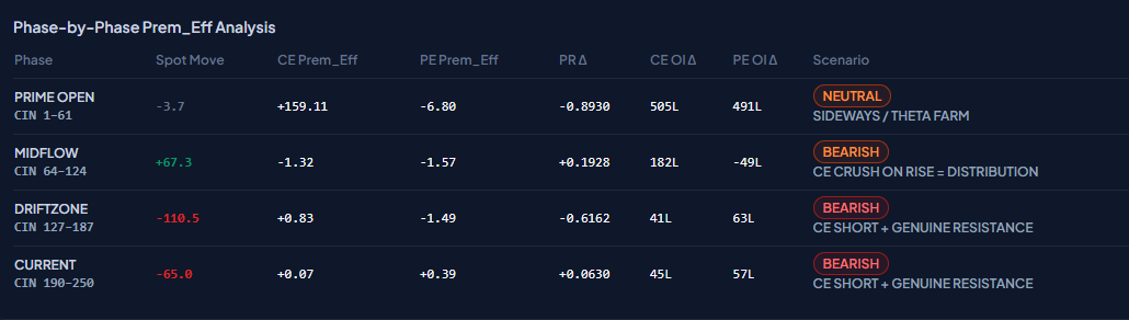
Phase Spot Move CE Prem_Eff PE Prem_Eff Scenario
PRIME OPEN (CIN 1–70) Strong initial move Negative (< -0.4) Negative (< -1.0) CE CRUSH ON RISE = DISTRIBUTION MIDFLOW (CIN 73–142) Reversal / pullback Slightly negative Positive (> +0.4) CE SHORT + GENUINE RESISTANCE DRIFTZONE (CIN 145–214) Continued drift Slightly positive Strong positive CE SHORT + GENUINE RESISTANCE CURRENT (CIN 217+) Minor drift / CE cover Positive (> +0.2) Strong positive MILD BEARISH – CE COVERING
📊 Seller Affordability Map — How to Read
General reference for interpreting the Seller Affordability Map section:
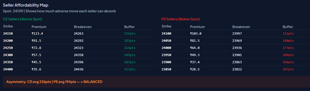
Side Strike Zone Premium Collected Breakeven Buffer Meaning CE Sellers Above Spot ATM/OTM Lower = weaker defense Strike + Premium Points before forced covering PE Sellers Below Spot ATM/OTM Higher = stronger floor Strike - Premium Points before floor breaks Asymmetry CE avg vs PE avg buffer — — Larger side = stronger defense. Balanced = rangebound.
📍 ATM Premium Migration
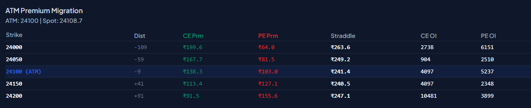
ATM Premium Migration tracks how the premium of CE and PE options at and around the At-The-Money (ATM) strike shifts as the spot price moves through the session. It gives you an X-ray view of where the real option weight sits across nearby strikes — and how quickly premium migrates as Nifty drifts.
What the Table Shows
The ATM Premium Migration table displays key strikes above and below the current ATM, showing: Distance from spot (Dist), CE Premium, PE Premium, Straddle value, CE OI, and PE OI for each strike. Here is a general breakdown of each column:
• Strike & Dist:
The strike price and its distance in points from the current spot. Negative Dist = below spot (ITM for PE, OTM for CE). Positive Dist = above spot (OTM for PE, ITM for CE... wait — reversed: OTM for CE, ITM for PE).
• CE Prm (green):
The current market premium of the Call Option at that strike. Falls sharply as you go below spot (deep ITM CE has low time value left).
• PE Prm (red):
The current market premium of the Put Option. Rises sharply as you go below spot (deep ITM PE carries intrinsic value).
• Straddle:
CE Prm + PE Prm combined. This is the total premium cost to buy both sides — i.e., the market's implied expected move. ATM straddle is the key reference.
• CE OI & PE OI:
Open Interest in contracts at each strike. High OI = strong positioning. The strike with highest CE OI = major call wall. Highest PE OI = major put floor.
How to Read ATM Premium Migration
7. Find the ATM strike (highlighted row).
This is the pivot — the CE and PE premiums here are roughly balanced when the market is neutral.
8. Read the straddle at ATM.
This is the market's implied range for the remaining session. If ATM straddle = ₹52, expect ±52 points of expected move.
9. Check CE OI vs PE OI at each strike.
The strike with the highest CE OI is the call wall (resistance). The strike with the highest PE OI is the put floor (support).
10. Watch premium skew above vs below spot.
If PE Prm at OTM strikes below spot is much higher than CE Prm at equidistant strikes above spot, market is pricing more downside risk.
11. Track OI concentration.
Heavy CE OI at a strike just above spot = active call writing resistance. Heavy PE OI well below spot = distant put support.
📊 ATM Premium Migration — Reference Snapshot
The table below shows the structure of the ATM Premium Migration section (using the uploaded dashboard snapshot as a reference example). ATM = 24000 | Spot ≈ 23993.6:
Strike Dist CE Prm PE Prm Straddle CE OI PE OI 23900 -94 ₹99.0 ₹3.4 ₹102.4 2,114 11,632 23950 -44 ₹55.7 ₹10.3 ₹66.0 2,940 10,801 24000 (ATM) +6 ₹23.7 ₹28.8 ₹52.5 13,439 12,818 24050 +56 ₹7.7 ₹62.5 ₹70.1 15,846 4,014 24100 +106 ₹2.6 ₹106.7 ₹109.3 17,784 3,393
Key Insights from ATM Premium Migration
• ATM Straddle (₹52.5) = the market's implied move for the remaining session. Nifty is pricing ±52 points as the expected range.
• CE OI is heavily concentrated at 24050 (15,846) and 24100 (17,784) — these are active call walls. Strong resistance zones backed by real seller positioning.
• PE OI is concentrated at 23900 (11,632) and 23950 (10,801) — these are the put floors below current spot. Strong support backed by PE writers.
• Premium Skew: At equidistant strikes from ATM (e.g., ±50 pts), PE Prm (₹62.5 at 24050-equivalent below) is much higher than CE Prm (₹7.7 at 24050 above) — market is pricing significantly more downside risk. Bearish skew confirmed.
• Spot is slightly below ATM (23993.6 vs 24000 ATM) — marginal bearish lean. PE at ATM (₹28.8) > CE at ATM (₹23.7) confirms this mild downside bias.
Trading Use Case: Using ATM Premium Migration for Entry Precision
When spot is near ATM and CE OI starts building heavily at the next OTM strike (e.g., 24050 CE OI = 15,846), that strike is a live resistance ceiling. If price rallies toward 24050 with CE Prem_Eff still negative, the call wall is holding and the rally is unlikely to sustain. This is a high-probability short entry zone. Conversely, if CE OI at that strike starts unwinding while spot pushes through, the wall is breaking — a CE wall breakout signal.
Next Steps
Ready to apply these OI concepts to your own live charts? Here's how to get started:
• Upload your current OI dashboard screenshot and ask for a phase-level read — I'll map the Prem_Eff scenario to current price action.
• Want a deeper dive into one section? Say 'Explain Seller Affordability Map' or 'Walk me through PCR divergence' and I'll go deeper.
• Building a trading plan? Drop your key levels + an OI snapshot and I'll help you structure entries, stops, and invalidation using the OI framework.